La Serenissima
Milan, 意大利
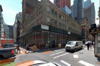
The building known as “Palazzo Campari” was designed in the 1960s by Ermenegildo and Eugenio Soncini in the heart of Milan and was one of a series of buildings that emerged during the economic boom years, representing a new aspect of corporate identity for Italian industry. It was originally characterised by the burnished colour of the metal structure of the facade, tinted glass of the curtain walling and the brown metallic paint used for the smaller block in via Cavalieri given over to residential use. When it was built, it was considered to be modern and technologically advanced, even experimental. Today however, many of its undeniably attractive aspects have become outdated with regards to current standards of building construction. For this reason the new owner, aware of its quality and evocative presence, decided to bring in architects to redesign the complex. With respect to the original layout, the aim of the new scheme was to provide a maximum level of flexibility in terms of the division of the internal spaces with sense of uniformity also given by the system of the internal lighting and improved access and circulation.
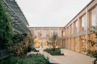
Other elements central to the design were the use of additional space at ground floor level as well as an overall reworking of the structure of the elevations, made much more open and vibrant especially on via Turati and part of via Cavalieri. With the elevations pulled back with respect to the original boundary it has been possible to eliminate cold bridging – at the time not considered – the useful floor area has been shifted allowing new spaces to be built at ground level, now given over to tertiary use. The landscaped courtyard meanwhile, the heart of the original scheme, has been retained and reworked into a bright new design.
The new elevations are the main feature of the design. On via Turati boxes in perforated and press-formed aluminium in a burnished colour (lit up at night) are used in a rhythm that enables the elevation to be reworked also to ensure maximum flexibility in terms of the division of the internal spaces. In the courtyard a close relationship has been created between the interior and exterior; on via Cavalieri the original lower elevation that is in direct relation with the nearby Cà Brutta, appears sleek and flat, with predominant use of grey for the glazed surfaces, smooth and reflecting its historic surroundings.


