Flagstore Louis Vuitton
Tokyo, Japan
Imagining Louis Vuitton – The proposal aims to establish an architectural equivalent of the identity of Louis Vuitton, which consists of a blend of classical and modern qualities. The LV products celebrate traditional craftsmanship, the mythology of travel, and luxury and celebrity. As a collection, these products create a historic line that connects you, as the customer, to other contemporary and historic participants in the material culture of Louis Vuitton. This material continuity is materialized in the architecture.
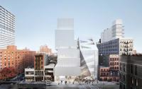
The idea of the Maison – The building follows the structure of a (grand) house: we distinguish three levels, each spanning a varying number of split-level floors. The three zones are vertically connected by a spine housing stairs and elevators; visitors can take the elevator to the top of their chosen section and then meander down, using the peripheral, curved staircases that connect the split-level floors.
Image, pattern and after image – The architecture of the Maison does more than display the products to best effect. It works together with the contents to give the visitors a vision of a coherent world and of themselves in it. This vision extends from the outside to all the details inside the building. For this reason, a design solution that enables a ‘fractal’ approach that preserves a unity between the large and the small scale was selected.
In this design, the element that holds the vision together and moves through all the scale levels is the leaf shape. Both the façades and the floor plans are characterized by large, leaf-shaped perforations and indentations that sweep over several floor levels. The leaf is thus found in the floor plan, in the section and in the elevation. It has been applied to the construction as well, responding to location-specific constructional demands.
The theme of image and after image is one which we explore in-depth in this project. Literally, the after imager refers to the lingering visual impression that is caused by intense or prolonged stimulation of the visual retina. To us, after images include the entire range of sensations and perceptions caused by intense impressions. The after image is the image of the building that you take home with you; your personal memory of the environment. In the store proposal, these visual imprints are strongly related to the way we handle the brand language of Louis Vuitton. The monogram has been elaborated, magnified, stretched out in many dimensions and directions, contextualized and dematerialized, to make its implicit presence felt throughout the store. This way of dealing with the brand, not literally quoting it, but architecturally responding to it.


