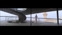
Low-Tech Offices
President Kennedypark 10, Kortrijk
Winner of the international competition organized by Vlaams Bouwmeester and Leiedal (Open Call) for the construction of a low-tech office building in Kortrijk, Belgium, the project represents our approach to a holistic and low-tech design and works on the essence construction and minimum plant equipment, obtaining maximum living comfort. The project criticizes sustainable design that aims to add super-performing glass facades, green-washing or photovoltaic panels on the roof to the building, often hiding the lack of quality of the design itself.
Searching for the site's DNA, we find the remains of what was apparently once a forest with a creek. Until the mid-1970s, the "Vanneste" farm (a square farmhouse enclosed by a ring moat and windbreak on the site) has been the only building in the fields that now form the Kennedypark.
The design for the new offices for Leiedal builds a bridge with the history of this place, taking into account not only the physical and historical transformations of the site, but also the knowledge, skills and economic development of the area. At the end of the 19th century, in addition to the flax and cotton industry, the brick and tile factories in the Kortrijk region developed into an important industrial branch. This is the reason why we have chosen to use bricks in an innovative way, in contrast to some of the recent interventions in the Kennedypark.
Important elements in our proposal include the remnants of the old ring moat, the brick construction, carbon neutral solutions, minimal use of techniques and the master plan that focuses on bicycle connections.
The first concept emerged from the reference of the English castle, which works with a main central void space served by rooms excavated in the wall surrounding this void. We value its layout as well as the ecological sustainability and materiality. The thick wall mass is an ideal thermal buffer. Finally, nature invades the building as an active presence for the users.
Following the same principle, we design a void space surrounded by a 70 cm thick façade, which works as a massive thermal mass of reclaimed brick on the outside and an insulating fast-construction monobloc that is finished with a lime plaster on the inside. The floors are constructed from traditional brick vaults with a central column that allows maximum flexibility.
The shell of the building, which contains the logistical functions, is conceived as an 'intelligent threshold’ between the landscape and the construction, between outside and inside temperature, between nature and artifact. The central office space, a large open space of 15 x 15 m, can be flexibly arranged to respond quickly to changing conditions. Corridors or lost circulation are avoided, informal meeting spaces are shared.
The ‘intelligent threshold’ houses meeting rooms, kitchenettes, stairs, elevator, storage rooms, sanitary facilities, and beautiful deep-lying terraces that are taken over by greenery. By bringing the high terraces deeper into the building, we obtain an ideal daylight access. In consultation with our building physics engineers, we design to find a balance between sufficient thermal mass and the filtering of excess radiant heat in the summer. In this way, the intelligent threshold makes a logical contribution to a low-tech building.
Above the entrance zone, the thick outer wall shows its hybrid character through a masonry claustra that simultaneously forms a transparent filter between the outside and the inside, but also accentuates the access from the cycle path.
The ground floor is conceived as an 'interior urban piazza', in direct relationship with the cycling and walking paths. The interior is an open space in brick around which the logistics are again staggered. Two movable installations define the central space: a coffee bar and a system with acoustic folding walls that demarcate the conference room for 50 visitors, allowing other activities to take place in the space around it.
The garden, designed by Jan Minne, presents itself as an oasis in the urban outskirts. It creates diverse, specific and characterful atmospheres. Sub-spaces become tangible, the seasons become visible through the flowing of colors and scents, offering plenty of space for personal fantasy, which allows the users to experience in a very intense way the blurring of the boundaries between the private and public world.
With its thick inhabited walls, the new office building for Leiedal is a building for the next 200 years: inhabited by people and plants, it becomes a metaphor of the search for a new equilibrium to inhabit the planet.
C+S Architects + MMA / Bart Macken Eef Boeckx
Transsolar / Daidalos Peutz / Ingenium / VIBE / Ney & Partners / Jan Minne Gardenist
- Architects
- C+S Architects
- Any
- 2021
- Project Status
- Disseny
- Client
- Leiedal
- Equip
- C+S Architects, Carlo Cappai, Maria Alessandra Segantini, MMA Architects, Transolar, Daidalos Peutz, Ney&Partners, Jan Minne Gardenist


