Sanlian Office Beijing
Crossboundaries’ design solution for the interior of the Sanlian magazine offices in Beijing combines the geometric logic inherited from the existing structure with the new workflow goals of the occupant.
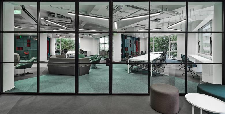
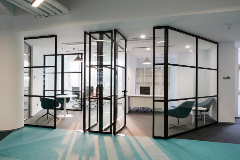
In initial conversations with the client, we got an interesting insight into the evolution that the company was going through – they targeted to adjust to a new way of working in a more open environment with high practical use and needed a space that would enable and reflect that. Detailed inquiries revealed their readiness to reduce enclosed office spaces and give way to a more transparent flexible environment with a variety of casual meeting points that enhance efficiency and influence the collaborative mentality.
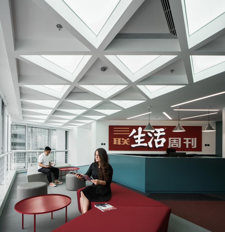
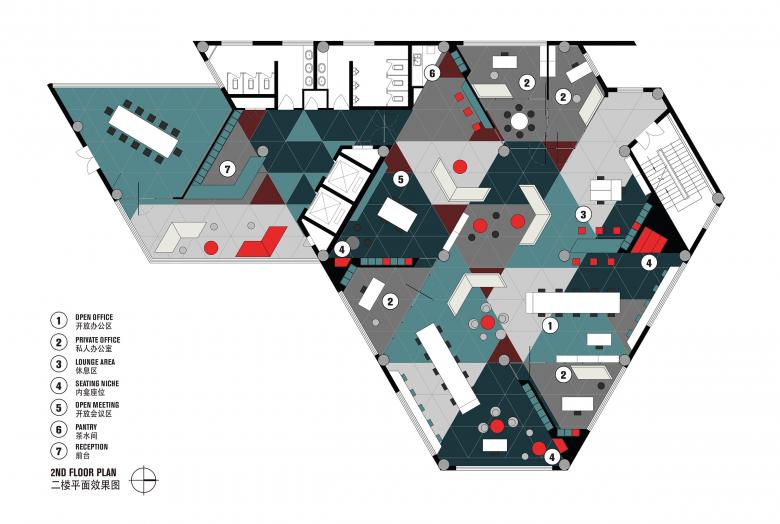
Inspired by the structural layout of the entire building that is based on a triangular grid, we continued this strong geometric DNA thread into the interior fit out. Besides the triangle, we found another clue that was all about the number 3. The occupant of the office is a publishing house called Sanlian (in Chinese 三联) with the number “3” in its name, focusing on three main domains – society, knowledge and lifestyle.
“Triangles, whether as mysterious ancient religious symbols, such as Solomon's six-pointed star, or purely as mathematical figures, bring us both mystery and vitality. In architectural design, triangles also convey a sense of stability, classicism and uncertainty,” stated DONG Hao, co-founder and partner of Crossboundaries.
These two inputs related to the number three were the initial starting point for the design.
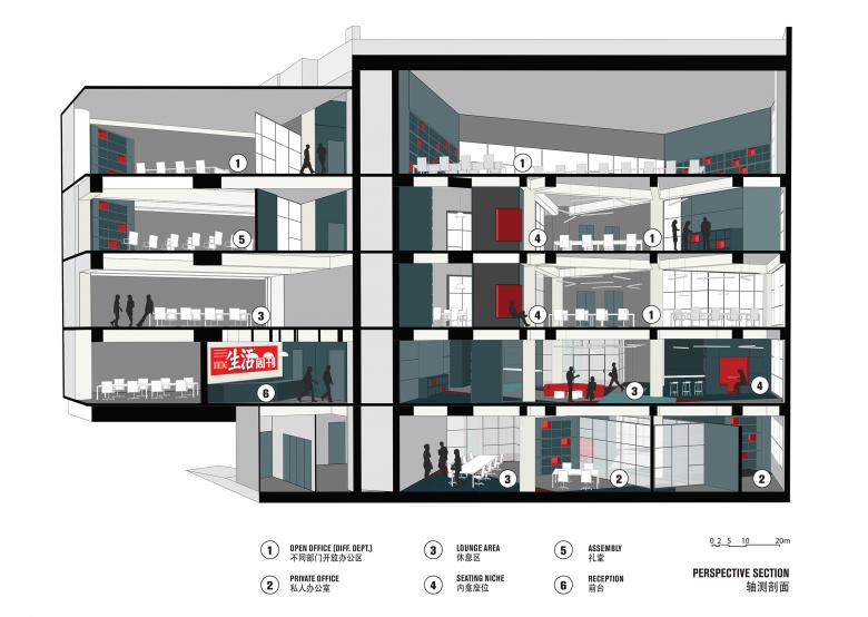
The total project area is about 2300m2, distributed equally across five floors and organized to satisfy different departments of the publishing company. Each floor is conceived as an open office, with varying additional program elements.
The first step of the design process was the program organization. We took the given area on each of the 5 floors as our “game board”. The existing column grid with the associated beams form a triangular pattern which allows for division into triangular pieces. This “board” is the space in which we are placing our program elements – namely: flexible working area, meeting space, leisure space and discussion space.
For each program element we developed a rule of placement – the work areas are grouped together and exposed to natural light, meeting booths are close to the circulation knots, leisure spots are bridging other elements and discussion hotspots are placed in the middle. With each of the program elements requiring a certain floor area, the design attributes a certain number of triangles to each and executes the zoning.
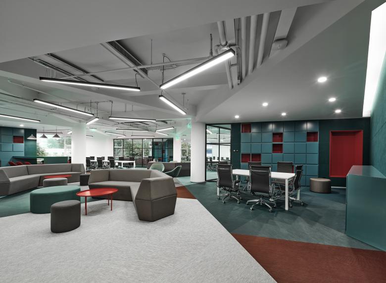
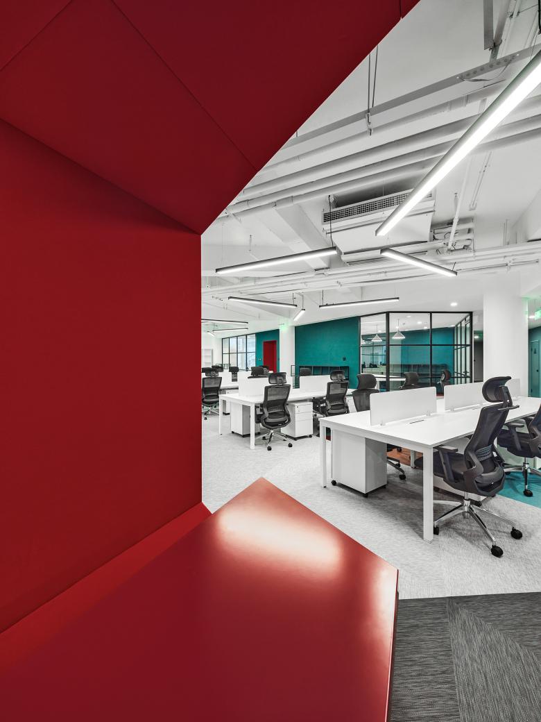
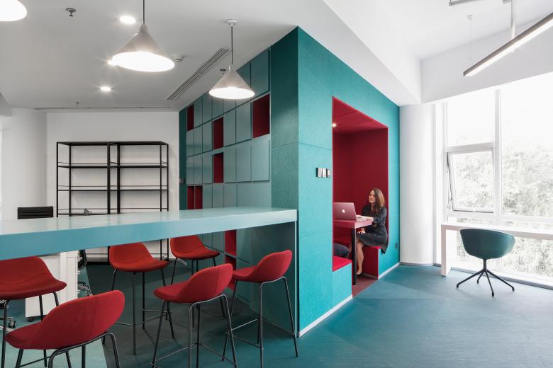
The result is a contemporary office organization that features open flexible office areas, enclosed fixed spaces, casual gathering niches and bigger meeting spaces. The way people use the space is not static – but subtly guided by the dynamic attributes of the triangle, the daily tasks get done in a variety of spaces depending on the time of the day and range from individual/private to collective or even communal, opening the office for events after office hours. This reflects the client’s desire to create a new lively office environment that encourages sharing and functions as a lifestyle hub – representational of the kind of message that Sanlian is also trying to convey in their magazine.
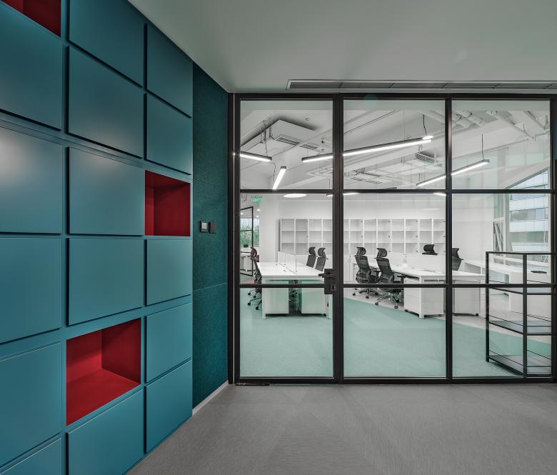
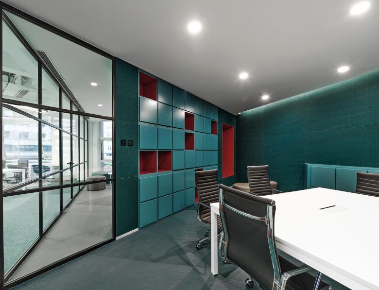
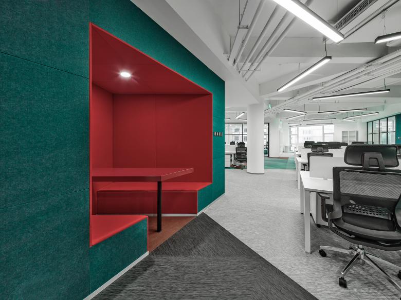
The triangular zoning further influenced the floor pattern and guided the color scheme of the space, including the red, which is part of the Sanlian’s Visual Identity. We opted for a bold combination of darker and lighter shades of turquoise and the punctuated burgundy red to create a vibrant combination that energizes the space. The ceiling embraces the triangulation as well. Following the direction of the beams, the triangular surface is stressed by linear lighting fixtures. The key lounge pieces of furniture outline the triangular intersections on the floor and even the signage system incorporates the triangle and rounds up the overall design.
“The geometric play makes the space highly functional, and lead to a holistic design that implemented triangulation not only in circulation, area division and program allocation, but also in the partitioning, lighting fixtures, and signage system. Sanlian’s new office offers the cilent a fresh, dynamic kick, an iconic new appearance that aligns with their work intentions,” concluded by Binke Lenhardt, co-founder and partner of Crossboundaries.
- Year
- 2020
- Client
- Sanlian (Sanlian Shenghuo Zhoukan)
- Team
- Binke Lenhardt, DONG Hao, YU Zhaoxiong, Silvia Campi, Johanna Leung, HAO Hongyi, YU Hongyu
- Construction Company
- Beijing Yihao Building Decoration Design Engineering Co.,Ltd.
